So you want to learn calligraphy? And you want to get good at it quickly? There’s no “instant download” shortcut, alas, but this series of articles will tell you how to get better faster.
Whether you want to learn brush lettering, pointed pen calligraphy (Copperplate, Spencerian, or more modern styles), Italic, Uncial, Blackletter, or any other calligraphy or lettering style, I’m sure you know it takes practice.
But not just any practice.
See, practice doesn’t make perfect, practice makes permanent.
So whether you have five minutes or five hours to spend, it’s essential that you practice effectively.
Good practice habits lead to beautiful letterforms. Follow these tips, and you’ll get better at calligraphy a lot faster.
How to Get Good at Calligraphy FAST
Tip #1: Conscious Practice
It is most important to practice calligraphy with conscious intention. Jotting off a few letters quickly and sloppily will develop sloppy calligraphy.
Instead, work with full concentration and care, whether it’s for five minutes, or five hours.
This is key: after you finish a letter, stop and analyze it.
See, when you’re learning calligraphy, you’re actually learning two things;
- Your eyes are learning how to see better.
- Your hand is learning how to draw letter shapes better.
If you have good hand-eye coördination, but your eye doesn’t recognize the difference between elegant shapes and ugly ones, your letters will never rise to expert level and you’ll never get very good at calligraphy.
So every time you practice calligraphy, remind yourself that you’re training your eyes and your hand.
Then as you draw each letter, compare it to the model on your exemplar and ask yourself, “How is the letter I just made different from the model?”
This is how I practiced calligraphy when I started, and it’s how I got better at it faster than most beginners do.
The challenge is that it’s hard for most beginners to really see the shapes. You’ve been writing all your life, and the shapes of the letters in your handwriting are engraved on your neural pathways, so without conscious, intentional practice, your letters will most likely devolve into a variation of your handwriting.
To avoid that, do what I did. Write one letter, then stop and really look at it compared to the exemplar.
Here are 10 things to watch out for, to help you see the differences between your letters and the letters on your exemplar.
Calligraphy Practice: 10 Things to Watch Out For
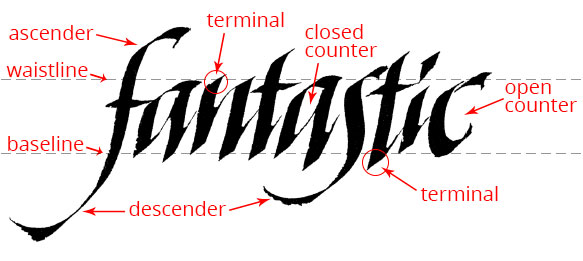
1. Shape (including ascenders/descenders) — are your basic shapes accurate and consistent?
All calligraphy alphabets (also known as calligraphy hands — but not fonts*) are built from basic shapes.

Making your basic shapes consistent is a big part of what makes your hand-lettering beautiful, and using the right basic shapes is what defines your calligraphy alphabet as Copperplate, or Italic, or Spencerian, and so on.
Change these basic shapes — even just a little — and you change the hand completely. Your letters will scream “I am NOT Copperplate [or Italic, or Spencerian, or what have you]!”
2. Counter Shape and Size — are your counter shapes and sizes accurate and consistent?
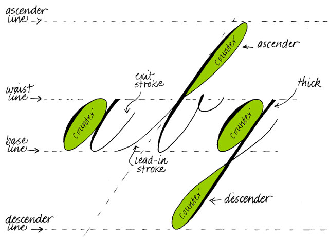
The secret to good calligraphy letterforms is as much, if not more, in your counter shapes — the spaces inside your letters — as it is in your pen or brush strokes. Get used to looking at the negative space, and think in terms of creating beautiful, consistent counters, and your letters will be beautiful, guaranteed.
In other words, if you take care of the counters, your letters will take care of themselves!
3. Height — are your x-heights and ascender/descender heights accurate and consistent?
The space between the baseline (the line that your letters rest on) and the waistline (the line that indicates the top of a lower-case letter) is called the x-height. A stem or loop that goes above the waistline is called an ascender, and a stem or loop that goes below the baseline is called a descender.
In traditional and formal alphabets, the x-heights of your letters should be precise and consistent. Ditto for your ascender and descender heights.
Things to ask:
Are my letters all touching the baseline and waistline at the same place?
Are my ascenders all the same height?
Are my descenders all the same length?
4. Branching — is your branching accurate and consistent?
Branching refers to where your upstrokes “branch off” from the stem or downstroke of your letter, as in this image:

In truth, if your basic shapes are accurate and consistent, your branching will be as well, but sometimes it’s easier to see branching than basic shapes.
Things to ask:
How high up on the stem is your branching occurring, compared to the model letter?
How much white space is there between branch and stem? What shape is that white space?
What is the angle of the branch? (This will determine the shape of the white space.) Is it straight or curved?
5. Slant — is your letter slant accurate and consistent?
Slant refers to the amount that your letters are leaning, whether forward, straight (no slant), or backwards.
Every calligraphy alphabet has its own ideal slant — Copperplate calligraphy is traditionally written at a 55° forward slant; Italic calligraphy at 5°; Blackletter calligraphy at 0° (straight up and down).

Some modern calligraphy alphabets have variable slants, so that the letters appear to dance back and forth. Can you see the different slants that are going on in this sample?
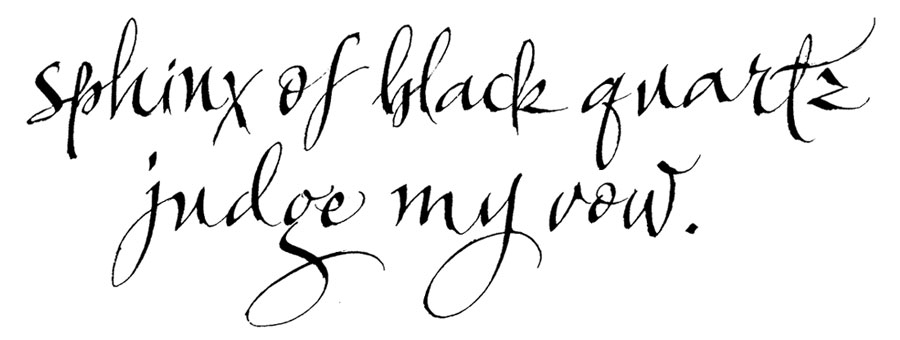
Traditional calligraphy hands are written with a consistent slant, and learning to write with a consistent slant at all times is important for the beginner. Mastering the basics will give you a strong foundation for developing your own styles later on.
Consistent slant is hard for most beginners, so to make it easier, I recommend using a set of guidelines printed with the ideal slant for the lettering style you’re practicing.
If your paper is light enough (i.e., layout paper, 20 lb. bond paper, or similar), just place your white paper on top of your guidelines.
Or print light guidelines onto plain bond paper, and write directly on them!
You can, of course, always draw slant lines yourself, using a protractor, a straight edge, and a light touch with a sharp pencil, but personally I’d rather spend my time making letters! 🙂
6. Pen Angle — is it correct? Is it consistent?
In broad-edge alphabets, such as Italic, Blackletter, and Uncial, the angle of the edge of your pen (or flat brush) — your pen angle — determines the thickness of your strokes. Different calligraphy hands require different pen angles to achieve the right look.
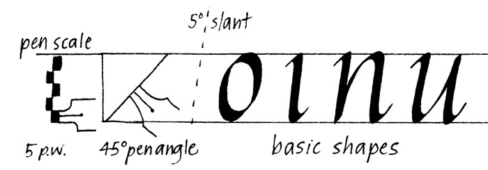
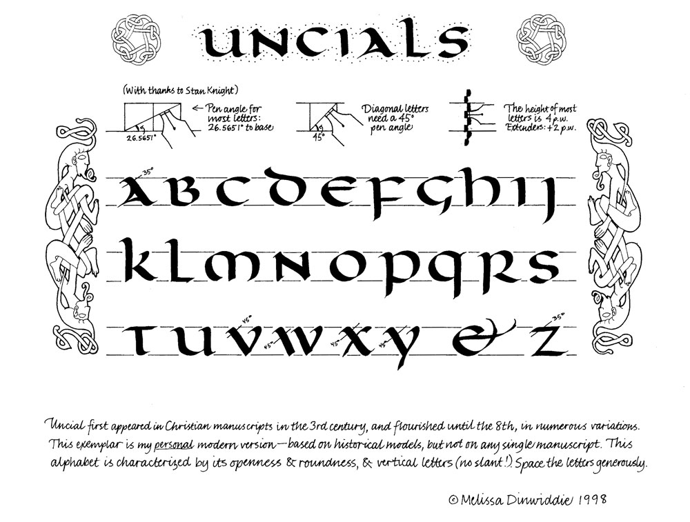
As you get more advanced, you may want to play with pen manipulation (i.e., twisting the pen as you write with it, to affect the width and shape of your strokes), but as a beginner, keeping your pen angle consistent is essential.
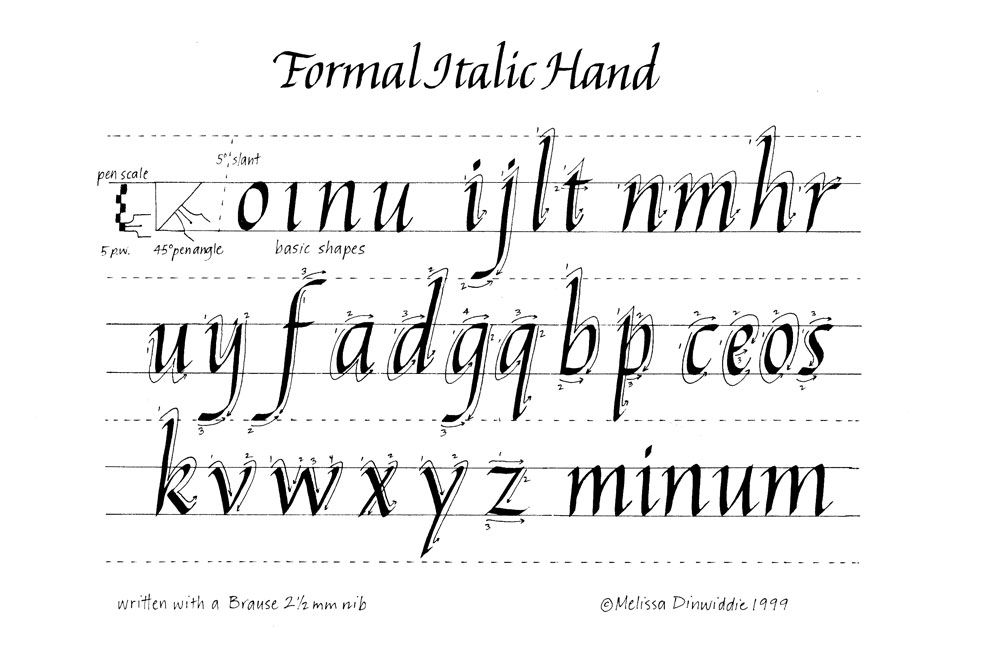
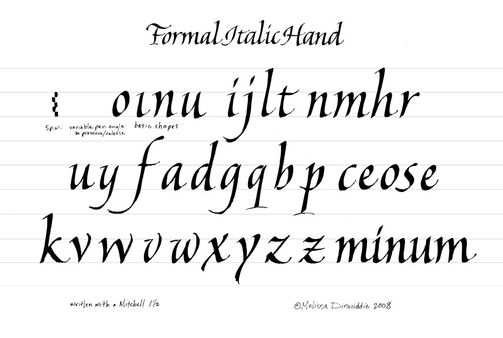
Check your pen angle against the pen angle of your exemplar frequently by holding the edge of your nib against the terminal (end of a stroke) of a model letter (but be careful not to get ink on your exemplar!)
Pointed pens are typically used at a consistent angle, too, usually so that the pen is pointing parallel (or close to parallel) to the slant line for the hand you’re writing.
Pen angle is also important for pointed brushes and brush markers, although it works differently for them.
With a broad-edge pen, the fattest stroke is made by holding the pen so that it points directly along the line you’re drawing — parallel to the direction the pen is pointing — as shown in this excerpt from a handout I made in 1998:

With a pointed brush or brush marker, the fattest stroke is made while holding the pen perpendicular to the line you’re drawing, as shown in this short video:
Pulling the pen *parallel* to the direction of the stroke will never get the fattest line (though if I applied more pressure it could get fatter than shown here.)
When I make those curved, U-shaped strokes, I make the left side thick by pressing more of the nib (or bristles, if it’s a pointed brush) onto the paper, while pulling *perpendicular* to the direction the nib is actually pointing.
To get the thin stroke on the right side of the “U,” I release pressure on the upstroke, so less of the nib is touching the paper.
(This is different from how it works with a broad edged or pointed pen. In each of those cases, you get the fattest stroke by drawing the pen *parallel* to the direction of the stroke. In the case of an edged pen, the chisel edge does all the work for you, as long as you’re holding it at the correct angle. In the case of a pointed pen, pressure on the pen spreads the two parts of the nib and creates a wider stroke.)
Pen: Pigma Brush
7. Weight — is it correct? Is it consistent?
The weight of your letters will be affected by their height in relation to the size of your writing tool (a wide pen or fat marker will make fatter letters than a smaller tool when written at the same x-height) and by your letter slant.

If you’re working with a broad-edged pen, weight will also be affected by the pen angle, as you can see with these three different n’s written at approximately the same slant, but drastically different pen angles:

In other words, if your letters look fatter or skinnier than your exemplar, the problem is one of the following:
- The x-height is too tall or too short.
- The letter slant is incorrect.
- The pen angle is wrong.
With a pointed pen, pointed brush, or brush marker, letter weight will also be affected by the amount of pressure you use. Even if your pressure isn’t exactly like the exemplar you’re copying, if your pressure is consistent, your calligraphy will look good. 🙂
8. Spacing — is it pleasing and consistent inside and between letters? Between words? Between lines? Between stanzas/paragraphs?
Remember how I said that the secret to good letterforms is as much in your counter shapes as the letters themselves? Well, this goes for the counters between the letters, too!

It’s hard to make your letter spacing consistent, but this is hugely important to pay attention to! It can help to squint your eyes when you analyze a word you’ve calligraphed.
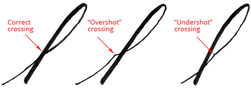
9. Connections & Crossings — are you overshooting or undershooting, or is it just right?
When a calligraphy letter has an ascender — like lower-case h, k, and d — one of the most challenging things is to get the ascender and the rest of the letter to connect accurately.
With ascender loops, you may find that you need to pull your loop much further to the right than you think, to avoid overshooting. Or, if you get the opposite problem, undershooting, you’ll need to make the upstroke on your loop closer to vertical.
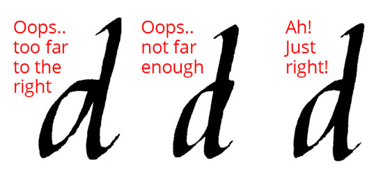
With lower-case d with a non-looped ascender, you want your ascender downstroke to perfectly cross the right side of the bowl of the letter.
10. Terminals — are they the right shape? Are they consistent?
Every stroke has a starting point and an ending point — these are referred to as terminals. Terminals vary greatly between calligraphy alphabets, and they’re easy to disregard, but pay close attention to them! Just as basic shapes define a calligraphy alphabet, so do terminals!

Are the terminals on your exemplar fat? skinny? pointed? flat? round? How can you make the terminals on your calligraphy look closer to the letters on the model?
.
Calligraphy is not handwriting — it’s more akin to drawing than to handwriting. It will help you tremendously to think about drawing basic strokes and adding them together, rather than writing.
.
While some calligraphy alphabets are faster than others (pointed pen Copperplate is notoriously slow; casual, modern calligraphy made with a brush marker may be much faster), allow yourself to go s l o w l y.
.
Again, DO NOT THINK ABOUT WRITING LETTERS! Instead, concentrate on making basic strokes and adding them together, and voilá, you will make beautiful letters! 🙂
So there you go! Next time you sit down to practice, stop after every letter and compare it to your exemplar, keeping in mind these 10 things to watch out for.
If you do this, you may be amazed at how quickly you improve!
Do you have anything to add to these tips for what to look for when practicing calligraphy? Share them in the comments below!

* Although you may see people referring to calligraphy alphabets as “fonts,” that is a typographic term, and is technically incorrect to use in reference to letters drawn by hand.
Here’s an accurate definition of “font” from nerdplusart.com/type-terminology-smackdown/:
“A font is a set of type of one particular face and size. A typeface is a family of fonts (very often by the same designer). Within a typeface there will be fonts of varying weights or other variations. E.g., light, bold, semi-bold, condensed, italic, etc. Each such variation is a different font.
In the world of hand-lettering, a particular alphabet is technically referred to as a “hand.” If you want to impress a calligrapher, instead of asking “What font is that?” ask, “What hand is that?” 🙂
PS — Pssst! Know someone who might benefit from seeing this today? Pass it on!
