One of the things that creates beauty in formal calligraphy (i.e., calligraphy based on historical models, rather than expressive, experimental, “modern calligraphy”) is consistency.
Not only must every “a” be as identical as possible to every other “a,” but the letters in a particular script must feel like they belong together. As if they are members of the same family.
What makes letters feel like they belong to the same family?
Certainly consistency of size, weight, pen angle (where applicable), letter slant, and relationship to the baseline/waistline are all important.
In addition, and intimately related to the above,
every formal alphabet is based on a set of basic shapes, composed of one or more basic strokes.
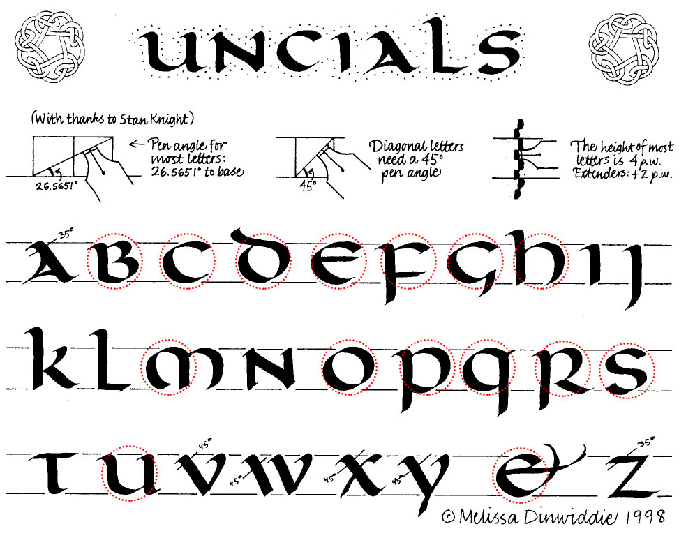
For example, Uncial is based on a circle, as you can see in this exemplar I made way back in 1998.
Italic is based on an oval or lozenge shape, and sort of rounded triangle, as shown in this exemplar from 2008.
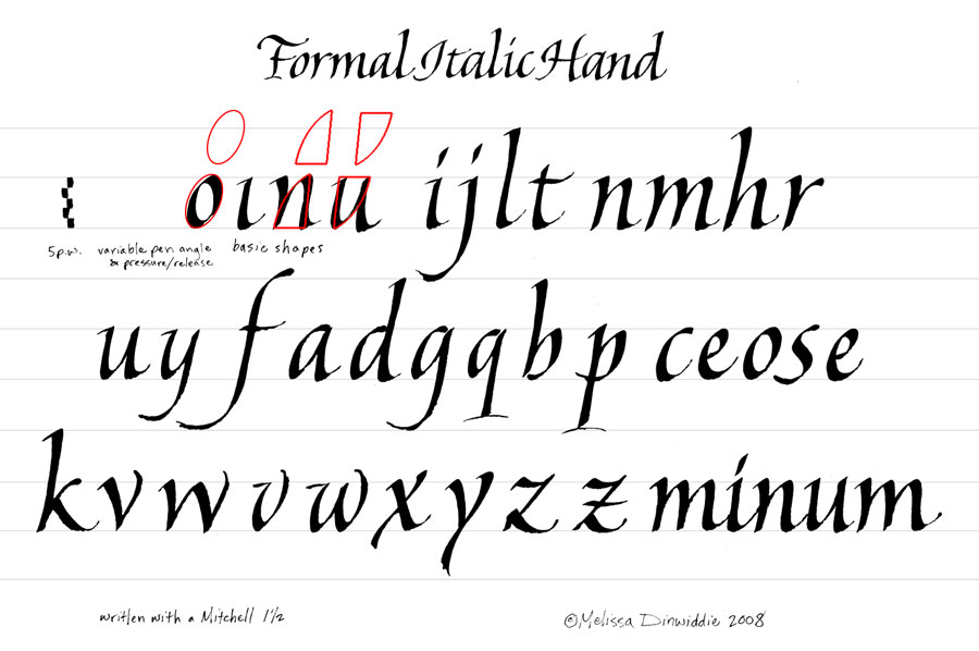
(This was a huge surprise to me as a beginning calligrapher!)
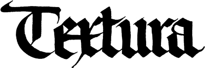
Textura, a form of blackletter, is based on the parallel lines of a parallelogram, as shown in this example by Meredith Klein.
The less formal the script, the more freedom you have to vary size, weight, slant, pen angle, relationship to the baseline/waistline, etc.
Check out the examples below of informal scripts:
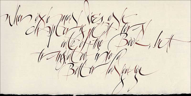

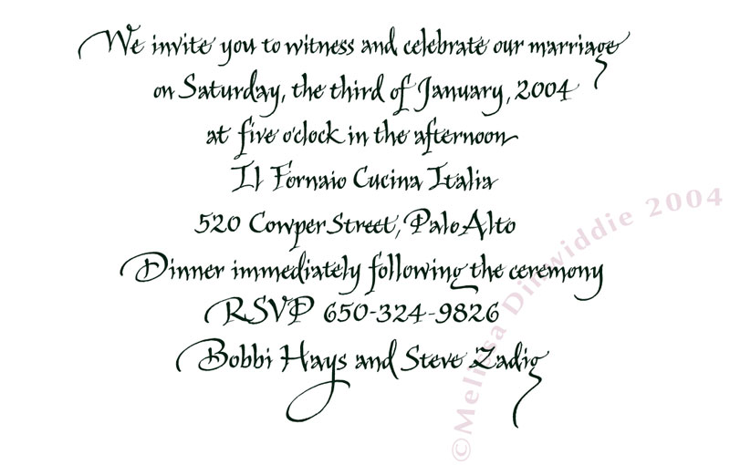
If you look at the examples above again, you’ll see variation, but also consistency.
Even with informal, modern, experimental scripts, if your letters conform to a unifying basic shape (or shapes), your calligraphy will feel more unified.
Learn the Rules First, THEN Break Them
There are, it should be said, wonderful examples of beautiful calligraphy that utterly rebel against any sense of a unifying basic shape, but if you endeavor to learn calligraphy, you’ll be better off following the rules and mastering consistency first, before you veer off into rebellion.
Learn the rules well, then go off and break them! 🙂
A solid understanding and mastery of the underlying basic shapes of any script you take on will take your calligraphy from amateurish to professional-looking, so practicing basic shapes is essential if you want to improve.
In fact, here’s my secret for anyone endeavoring to learn calligraphy:
Don’t Focus on Making Letters!
Whaaa..??
That’s right: don’t try to make letters!
Instead, try to make consistent basic strokes
Here’s the deal:
If you concentrate on forming the basic strokes for your script, and then joining those strokes together, your letters will end up beautiful, as if by magic.
Sounds simple, right?
Turns out this is a lot harder than you might think. Our left brains are so fixated on making the symbol of an “a” that we stop seeing the actual shape.
But in order to make a beautiful “a,” you have to stop thinking about making an “a,” and instead think about making basic shapes, and joining them together.
I can always tell when as student is trying to make a letter, rather than focusing on making basic strokes and joining them together!
How? When the script’s basic shape is nowhere to be seen, it’s obvious the student is thinking “a” instead of “basic stroke 6 + basic stroke 2.”
A Good Place for Beginners to Start… With Markers!
Copperplate is a great calligraphy script to start with. It’s based on an oval, which is relatively easy to grasp and duplicate.

Traditionally, copperplate is written with a flexible pointed nib, but pointed pens are tricky to master, and they add the complication of using ink, which can be daunting. So for absolute beginners, I’m a fan of starting off with markers: pointed brush markers.
Need help finding supplies? Click here for an article about the Best Brush Calligraphy Supplies for Beginners.
Now, don’t get me wrong — brush markers also have their challenges. As with the pointed pen, the student needs to learn to control the amount and timing of pressure — but markers’ accessibility and portability make them a great tool to get started with.
I like to start beginning brush students off with Tombow Dual Brush Pens (aff), or the slightly smaller Kuretake Pocket Color Pens (aff). With their long, cone-shaped tip, they force you to write larger than pens with smaller tips, which I think makes it easier to see your letter shapes (1/2″ x-height works well for Tombow Dual Brush; 3/8″ x-height for Kuretake Pocket).
That said, any brush marker will work. (Another favorite is the Pentel Fude Touch Sign pen (aff), which is great for smaller writing — 1/4″ x-height works great for these.) Just note that a brush marker with a flexible fiber/felt tip will be easier to control than one with an actual bristle tip.
Now that we’ve covered the background, stay tuned for my next article, in which I go over how to create the basic strokes for formal brush copperplate calligraphy!

PS — Pssst! Know someone who might benefit from seeing this today? Pass it on!


Synchronicity 🙂 I’m doing something very similar at the moment: breaking letters into their components in order to find new combinations.