There’s a lot more involved in the business of being an artist than making art, as any working artist will tell you, and it’s the behind-the-scenes stuff that often drives us crazy!
Case in point: photography.
In order to send out paintings in my ArtSpark Newsletter, and post them for sale or auction, I need pictures. You might think this would be an easy proposition — either plop the paintings on a scanner (after all, they’re small enough to fit on a letter-sized flatbed scanner), or grab a camera and snap away, right?
Wrong!
At least wrong when your goal is to get good pictures of white paintings with a lot of texture! It turns out that this is a very tricky proposition, but after much experimentation, I’ve finally hit on a solution that’s working fairly well, so I thought I’d take some time to share it with you.
Major Fail: Scanning
First I tried scanning, with my shiny, new Epson Perfection V600, which I purchased on Amazon after doing a ton of research. It’s a great little scanner, and does a beautiful job on graphics, and on paintings that are mostly color, but when there’s a lot of textured white involved, the results are not what I was hoping for.
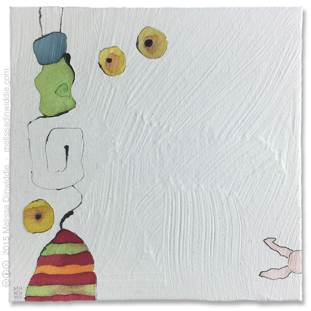
Here’s a scan of my 6″ x 6″ painting, Shy Rabbit:
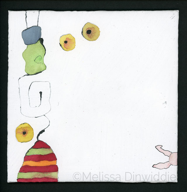
Whoa, Nellie!
The colors are pretty darn accurate (score for the scanner!), but there are a lot of problems here. For one thing, although the scanner captures certain details amazingly well, in this case, it’s getting the wrong details — tiny bits of fiber that are barely noticeable to the naked eye stand out here like sore thumbs, while the white areas are pretty blown out.
Most problematic, though, is that the scan offers virtually no sense of the brushstroke texture that is such a signature element of the painting.
There are certain circumstances in which a scan like this could work extremely well — for example, if I want to drop the white background out entirely and clip just the colorful elements for printing at a high resolution (as illustrations to decorate a book, say). If my goal is to give potential online purchasers a feeling for what this painting would look like hanging on their wall, however, scanning is not going to be the right solution
The Problem with a Scanner for Textured Art: Lighting
I was pretty sure I knew what the problem was with the scanner, and it’s not that there’s anything wrong with the Epson V600; it’s a problem inherent in all desktop scanners: the angle of the lighting.
Scanners (at least the kind that I can afford!) aim light straight on at whatever’s resting on the glass platen, and as any Hollywood actress worth her salt will tell you, direct light is great for smoothing out wrinkles, or indeed, any texture! Direct light basically blasts out all shadows, and without shadows, you simply can’t see texture, be it wrinkles, or brush strokes.
Great if you’re a Hollywood actress who wants to look younger than your years, but not so good if you’re a textured, white painting and want to show off your texture to the world!
I learned this lighting lesson years ago, when I created a custom ketubah on commission for private clients, and took it to a photographer to have it digitized. I was in the studio with the photographer when she did the shoot, and I remember it took a lot of trial and error to get the lighting just right, because the piece was a collage, built up in multiple layers of tiny pieces of rather thick colored papers.
Collage is often fairly flat, but this piece was actually a low bas relief, rather than a flat, smooth surface, and it was very important to me to capture the dimension of the artwork.
Here’s a detail shot of the image the photographer captured:
How did she capture all that dimension? Shadows! Which she created with some pretty tricky lighting.
Steeply Raked Lighting = Deeper Shadows
Normally, when shooting flat artwork, you want to set the lights up at a 45-degree angle to the artwork, as shown in the diagram below.
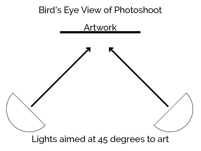
For a piece with a lot of dimension, though, this standard lighting set-up is not going to work very well. Two lights are likely to create too many shadows, which make the textures hard to read, or they may cancel each others’ shadows out, removing the texture altogether.
At the ketubah shoot, we tried all kinds of lighting set-ups, and nothing seemed to work. Then, finally, in desperation, the photographer set the main light up almost against the wall, aimed not at the artwork, but across the artwork, from right to left, like this:
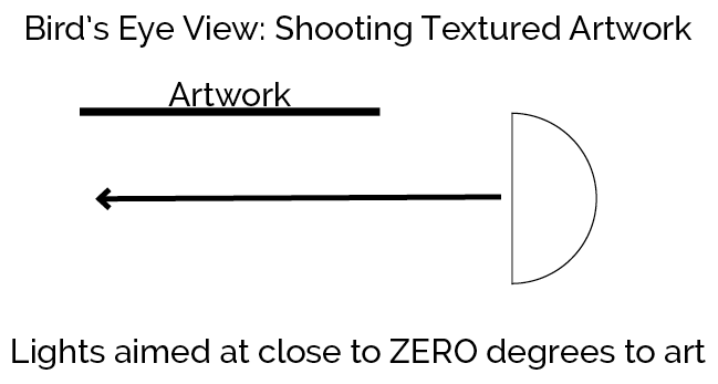
Challenges with Steeply Raked Lighting
The problem with steeply raked lighting coming from one side like this, is that the side of the art closest to the light will naturally be more brightly lit than the side furthest away from the light. (Trust me — I spent a week editing the scanned ketubah in Photoshop…) Adding another light on the other side of the painting will result in a more evenly lit surface, but more even lighting also means less texture.
What to do when you want even lighting and texture? Well, this is where you have to get creative.
One obvious solution would be to shoot for maximum texture, then fix the uneven brightness after the fact in Photoshop. I have the chops to do this, but it’s a bit time-consuming. Even if the lighting is exactly the same for every painting, there’s going to be some judgment required during the editing process, and judgment = time. Plus I now have an assistant who edits my images for me, and I’m too much of a control freak to outsource those kinds of judgment calls. 😉
So if I’m not going to fix the lighting issues in Photoshop, the other option is to find the best trade-off between even lighting and obvious texture during the photoshoot itself, and that’s what I’ve attempted to do. My solution? Raked lighting plus a reflector.
Using a Reflector to Bounce the Light
We’ve already established that two lights pointed in opposite directions at the painting will defeat the purpose of the raked lighting, by canceling the shadows out. Thankfully, there’s another solution: using a reflector, to bounce some of the light back in the other direction.
In this case, my reflector is a 12″x12″ canvas panel, still in the shrink wrap (very high-tech, I know 😉 ). It’s white, so a lot of the light gets reflected, plus the shrink wrap adds a little extra reflectiveness.
The cool thing about using a reflector is that you can adjust how much light gets reflected (which affects both the evenness of the appearance of the lighting, and the depth of the texture) simply by changing the angle.
Here’s a diagram to show how that works:
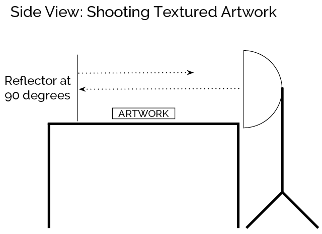
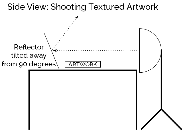
How do you figure out what angle is best to get the results you want? Trial and error. I shot a bunch of pics with different set-ups — no reflector, reflector at 90 degrees, reflector angled slightly away from the art, reflector angled slightly toward the art — then I opened the images up on my computer and picked the one I liked best.
Actually, it’s more accurate to say I picked the set-up that provided the best compromise between even lighting and texture. I’m not a professional, and I’m working with limited equipment and skills, so “good enough” is the best I can aim for (and thanks to my being a practicing Imperfectionist, I am learning to accept “good enough” as (ahem) good enough. 😉 )
The Rest of the Equipment List
Tripod
In fact, I’m not using a tripod at all for these shoots — I’ve hacked together a set-up from bed risers (which I got here on Amazon, for raising tables to standing height for my workshops and retreats) and a metal T-square! It’s not very pretty, but it’s what I happened to have around, and it works. Here’s a pic:
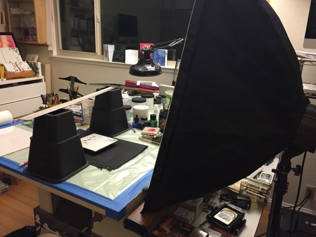
I set the bed risers above and below the painting, and rest a 24″ metal T-square across the top of them. The T-square is the perfect width for resting my iPhone on it, so it can aim down at the art with the lens on a level plane, parallel to the face of the art.
The photoshoot itself isn’t pretty, but that doesn’t matter, as long as the results are good. 🙂
Background/Backdrop
Basically, this is just whatever is going to show behind the painting — this can be an even-toned piece of paper or fabric, or just a wall.
If you’ll be cleanly cropping the edges of your images (ie, cropping off the rough edges of a painting to create a perfect square or rectangle), then naturally the background doesn’t matter. If you don’t mind the background showing, however, generally you want your background to be as neutral as possible, so as not to distract from your art.
In my case, I like to drop the background out entirely in the editing process, to achieve the look at the top of this post, so rather than maximum neutrality, I want a background that creates the maximum amount of contrast between the edges of my paintings and the background. Since my paintings are mostly white, that means a black background. When I’m shooting a painting that’s mostly black, on the other hand, I’ll use a white background.
In either case, a sheet of paper does the trick.
Camera (iPhone 6)
Since I don’t have a good DSLR, I’ve been using my iPhone 6 to shoot my little white paintings, using my iPhone 6. The downside of using my phone is that the digital file isn’t big enough to print more than about 7″x7″, but since my primary need right now is for images for web and email, I’m living with it for now.
It also has the upside of being really easy and lightweight!
Light
Last year I bought this set from Fovitec — two daylight fluorescent softboxes with stands. (Were I to do it again, I’d get LED lights instead, because they use a lot less power, require a lot less storage space, and are much faster to set up. However, they’re also more expensive, so I opted for the cheaper option for now.)
For this particular setup — small paintings that need steeply raked lighting — only one softbox is called for. I’ve played around with the angle of the lighting, and approximately 90 degrees to the painting seems to work best, though your mileage may vary. Trial and error is the only way to find out what you like.
Here are some more pics of my set-up.
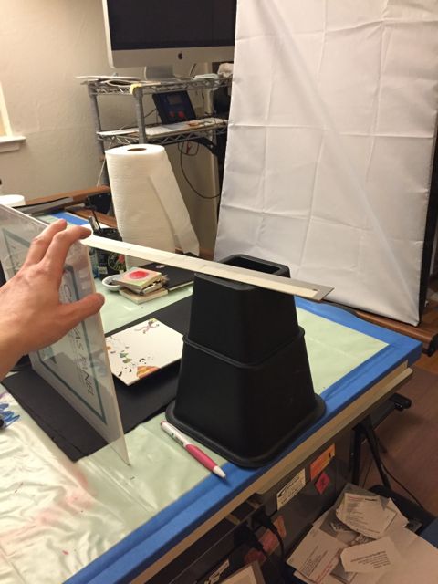
My high-tech reflector holding device (my left hand!):
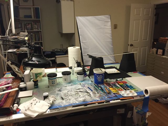
A view of my art table, with my photoshoot set-up in place. Because I’m working small, and I have a pretty good sized table, I can keep my photoshoot set-up up while I work, which is convenient!
Below is a pic of the risers I use to bring the face of the paintings up a little closer to the camera. My “tripod” is just a tad too tall — pics have more margin than I’d like, and the painting itself comes out a little too small. Since it’s not adjustable, I’m not able to lower my camera closer to the painting, so instead I raise the painting closer to the camera!
For my canvas boards, I just stack a couple of 3/8″ art boards, one on top of the other, and rest the painting on top. When I shoot 5″x5″ paintings, I raise them even more, so the painting takes up most of the viewfinder.
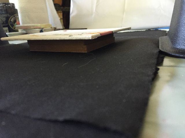
(Notice the cat hairs? When you live with a white Siberian cat, kitty fluffs find their way into everything…)
Here’s a view looking down at the painting “risers,” on top of the black background paper, with the T-square angled over it. I’ve offset the bed risers to angle the T-square like this, because it offers a stable platform for my phone, and allows the lens (which is in the upper right corner) to get an unobstructed view of the painting.
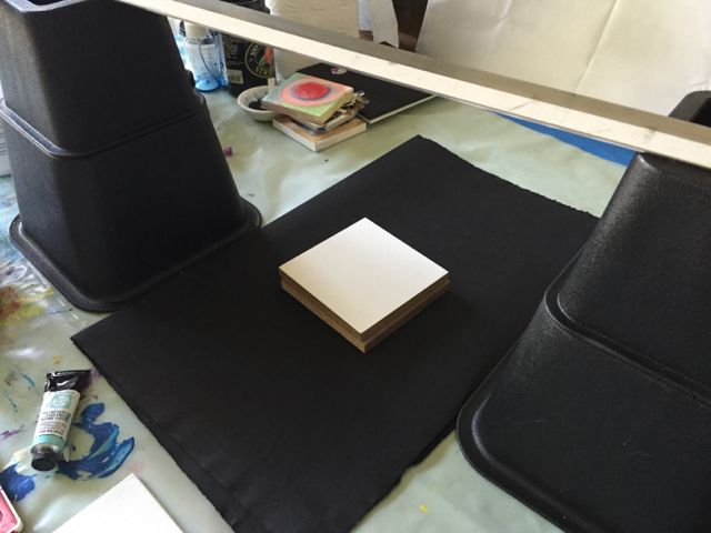
And here are the results!
No reflector:
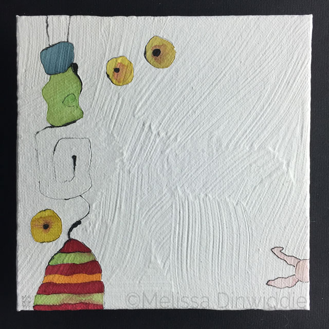
I’m loving the texture in this shot, but the left side of the painting looks a lot darker than the right, which I’m not loving so much. Here’s when it’s time to pull out the reflector.
90-degree reflector:

The lighting is definitely more even in this pic, but notice how the texture is getting washed away by the light. Here’s where it’s time to find a compromise.
Tilted away from 90-degrees reflector:

The lighting is definitely not perfect, but this set-up shows the texture so much better, and feels like the best compromise.
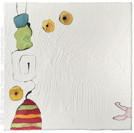
Voila!
The next step is to drop the background out in Photoshop and add a drop shadow, which gives us:
But that’s another post entirely…
I hope this has been helpful! If you have any tips to share on photographing art, I’d love to hear them!
(And meanwhile, if you just want to pay someone else to digitize your art for you, check out ArtSquare.com, a new service that hooks artists up with digitizers. Last I checked, it cost just $10 per piece… unless you have a tricky situation like textured white paintings, in which case you can expect to pay more,,,)

PS — Pssst! Know someone who might benefit from seeing this today? Pass it on!






This was fantastic. My knowledge of photographing artwork has multiplied many times after reading this. Thanks for creating such an informative post.
Kate
Oh, yay! I’m glad it was helpful, Kate. 🙂
Melissa, you are awesome!!! thanks so much for sharing your adventure. i can relate totally. i am an artist plus i make awesome candles, and photographing candles correctly without getting a ‘flash’ reflection, takes talent. i finally settled on putting white tissue paper on my flat stovetop, then taping more white tissue paper that’s been ironed (ha ha ha) from the vent down to meet the tissue paper that’s laying flat. i use a tripod, cheapish camera, and bring a BRIGHT floor lamp with a grow lite bulb on it, put that towards the side, and have found success using this method!! to photograph my canvas art, i take it outside on a cloudy day (lots here in Seattle area) and prop it against my old wooden gate. sometimes that works and sometimes not – i never want any ‘flash’ looking spots on the art, even thought i don’t use a flash, it happens. i could use a professional to photograph my stuff, but can’t afford it!!! we are women and we MAKE it work!!! hugs and wishing you the best!!! Joy.
Yeah, it takes some innovation and out-of-the-box thinking sometimes, Joy.
I wouldn’t call it talent, thought — I’d call it persistence, trial, and error! Getting the lighting and everything else to work is not something innate (ie, “talent”), but something that can be learned through effort. 🙂
Good for you for figuring out what works!! *fistbump!*
terrific info….keep up the good works. super art!
Thanks, duck. 🙂
Really helpful Melissa. I hadn’t thought of using another canvas as a light reflector, clever! I am also working towards the concept of being an imperfectionist, love it. Thanks! Tina
The other canvas board was just what I happened to have around, Tina. We work with what we’ve got. 🙂
Really cool, Melissa! Neat to see the techniques involved behind the scenes of your artwork, and the tools you use. Thanks for sharing!
You’re welcome, Jaromy! Glad you found it interesting. 🙂
Really, really helpful ! Thank you Melissa for all the details shared! I was thinking that only a photographer can make the perfect images of an art piece ..but with your tests you made me think that I should start trying to do my shoots!
I have a tendency to think that only a professional could get good results too, Aggeliki, but after having my art shot by others, I realized that I know my work better than they do, and the skills to take decent pics are very, very learnable. In most cases, you don’t actually need expensive, specialized equipment, either!
You CAN learn to do it yourself. You may CHOOSE to have others do it, but I believe in empowering myself and others to not feel beholden to others when it’s not necessary to be! 🙂
Great write-up! This was very helpful to me, and I appreciate you laying out all the messy details.
I’m actually in the middle of a series of white paintings right now, and was starting to wonder what kind of issues I could look forward to when I photographed them.
Glad it was helpful, Andrew. 🙂 Trial and error is the key with photography, I think. Good luck with your series!
What a fascinating post!
I’m super-inspired by the way you channeled your artistic inquisitiveness and creativity into solving a real-world problems such as this.
Thank you, Melissa.
Thanks, Jenna! Yeah, it’s fun to figure challenging stuff out! 🙂
Melissa! Love it. It’s always great to see artists experimenting with the best way to digitize their art. You do a great job with the diagrams 🙂 Wonderful post, my friend!
Thanks, Thomas! I’m looking forward to trying out Artsquare, too!