All done! Both my mom (procedure went fine, all is well–yay!), and this little abstract painting.
Here’s a color tip: if you’re not sure what colors to use, you can ALWAYS just stick with two complements, and your piece will look great, guaranteed.
Here I used blue and orange, directly across from each other on the color wheel.
The actual colors used: 4 watercolor markers from Winsor & Newton’s 12-marker set:
109 – Cadmium Yellow Hue
095 – Cadmium Red Hue
Mixed to make orange
and
139 – Cerulean Blue Hue
541 – Prussian Blue Hue
Mixed for the blue
ALL hues are a blend of all of the above, so everything looks like it goes with everything else, because it DOES! 🙂 This is an easy “trick” to stop all your paintings from looking so jarring: stop using colors straight from the tube or palette, and start blending them. ?
Have fun!
#creativesandbox #creativesandboxway #doodle #doodles #doodleart #doodleartist #doodlesofinstagram #dailydoodle2017 #dailydoodle #dailycreative #dailyart #artistsofinstagram #artistsoninstagram #abstractart #originalart #originalartwork #tinyart #miniart #tinycanvas #abstractpainting #pigmamicron #winsornewton #watercolormarkers
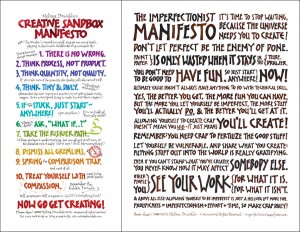 Subscribe to My Insiders' Newsletter & Get My Manifestos Poster
Leave a Reply