via Instagram http://ift.tt/1oT2XQ3

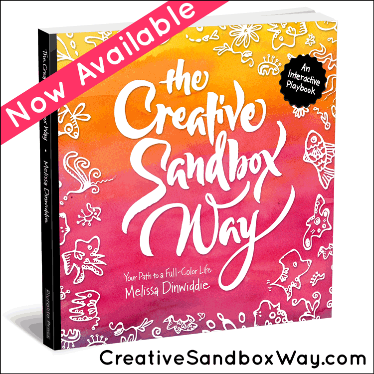
I have a new goodie for you! Over the past week I’ve been hard at work on artwork for my Imperfectionist Manifesto. I just made it available as a poster in different color options over at my Zazzle shop (and I’ll soon send my subscribers a link to get a free, printable PDF, along with the PDF of my Keys to Creative Flow).
There’s a story behind this artwork, though, both the creation of it, and the sharing of it — a story that includes being bashed on my own Facebook page. I learned a lot from this experience, and it felt important for me to share what I learned, so you can benefit from it, too. [Read more…]
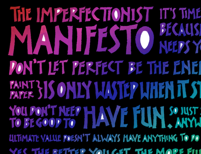
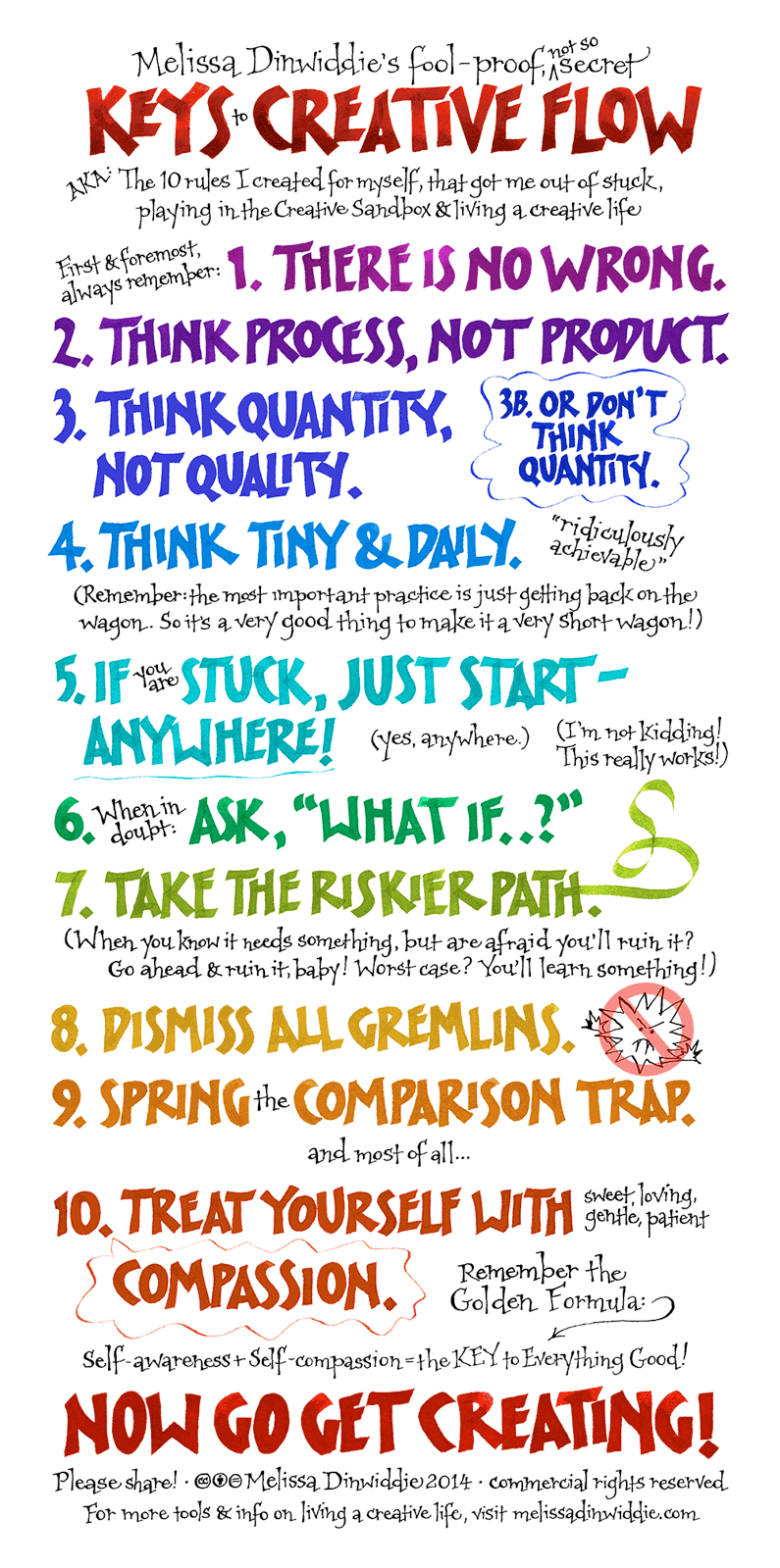
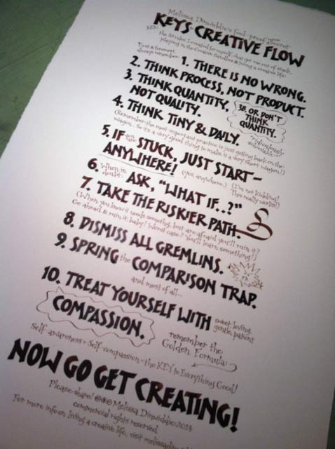
I’m delighted to share with you my latest gift to the creatives of the world: a new graphic and poster of my Keys to Creative Flow.
Formerly called the “10 Rules for the Creative Sandbox,” these are the “secrets” that got me out of more than a decade of resistance, and back to joyfully creating again. I draw on these “rules” myself on a daily basis to keep perfectionism and gremlins at bay, and I hope you find them useful, too.
Please share the graphic below, post it on your own blog or website, and if you’re a subscriber to my insiders’ newsletter, I’ll send you a link to a letter-size PDF to print out and hang on your wall! (If you’d like a larger version, I even have a poster for sale, which you can buy here.)
The funny thing is that this artwork almost never got made. If not for the Keys themselves, it surely wouldn’t be here now!
I’ve been wanting to turn my Creative Sandbox Rules into handmade artwork for over a year, but… Well, scroll below the artwork and read on for the full story…
Back in 2011, on the first day of February, I made the commitment to spend at least 15 minutes every day that month making art.
With the exception of an art retreat I went to every spring, it had been over a decade since I’d really made art for myself. I’d built up a business making art to the specifications of clients, and after so much time focusing on pleasing others, my perfectionist tendencies had gotten out of control.
I was stuck. Blocked. My poor creative spirit was languishing, locked away in a closet.
Now, though, I was determined to change that, and I knew I needed as much help as I could find to get me past the perfectionism and gremlin voices. My biggest problem, I realized, was that I never felt like anything I did was good enough, so instead of trying, I’d been making excuses, blaming my non-existent output on “lack of time.”
Ha.
On February first, an artist I was interviewing shared that she tells her mentees that if they can’t put 15 minutes a day into their art, they’re just making an excuse. A lightbulb went off over my head, and I finally accepted that it wasn’t a matter of having the time, it was a matter of making the time! I committed then and there to try out this 15-minutes-a-day thing, with a goal to get back to the playful state of freedom I remembered from nursery school — I wanted to feel like a little kid playing in a sandbox.
The notion of the Creative Sandbox was born, and with that metaphor in mind, I designed a short set of guidelines for myself — “rules” that I would keep always in mind when I approached my art table.
Initially, there were just three of these rules — the bare minimum that I thought would help get me past my resistance and creating again:
[box]
[/box]
The rules worked. Setting the intention to create regardless of what I thought of the outcome, combined with the accountability of the public statement of commitment, led to a highly prolific month.
That grew into a highly prolific year: from February 1 to December 31, I completed over 150 artworks, which I started referring to as ArtSparks.
About a year later, when my friend Sue Ann Gleason invited me to be interviewed as part of her Well-Nourished Woman Inner Circle near the end of 2012, she asked about the rules I’d developed to get me creating. Our conversation helped me realize that I had many more tools in my box than those original three rules. So I expanded the three to ten “Rules for the Creative Sandbox,” and even designed a week-long mini-course around them — Creative Sandbox 101.
The Creative Sandbox Rules have continued to evolve since then, growing more pithy and concise, and even spawning a seven-minute presentation and an original song!
Meanwhile, I had slapped together a downloadable PDF of the rules to offer as a freebie, but what I really wanted was to create a colorful, hand-lettered poster.
I am a calligrapher, after all. It felt only appropriate that I would use my skills in service of my message.
But I never managed to make the time…
Until recently, when I realized that — lo and behold — I’d fallen into the perfectionist trap once again!
The real reason I’d never created a hand-made poster was because I wanted it to be awesome. I wanted it to blow people away. And of course, there is nothing like the pressure of awesomeness to shut a creative down, fast!
Oh, the irony…
The beautiful thing, though, is that I had my Golden Formula (self-awareness + self-compassion = the key to everything good) and my Creative Sandbox Rules themselves to help me out of that trap!
I realized I could use my rules to help me past the “this won’t possibly be good enough” gremlins. I could approach this poster as a Creative Sandbox project — an imperfect thing, that I could have fun with!
I could use my rules to make a poster of my rules!
Take that, perfectionism!
This weekend I finally completed the artwork, and today it makes its debut, retitled as my Keys to Creative Flow.
I knew I wanted to change the title, because most people would be unfamiliar with my Creative Sandbox metaphor, not to mention the fact that most creatives balk at anything claiming to be a “rule.” (After all, most of us are rebels at heart!)
So I floated some possible titles over on Facebook, which elicited a flood of Very Strong Opinions, and helped me land on the new title, Keys to Creative Flow.
All that was left was to design and execute the artwork! Not a small task, but one I knew I could complete within a week or so.
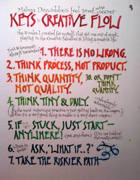
First, last weekend, I booted up Adobe InDesign to cobble together a mockup, which I printed out to use as a layout guide for the hand lettering on the final artwork:
Then this weekend I hit my art table, hard. I mean, hours. Several of them.
On Saturday, I lettered out several lines in a trial run, using a pointed pen, India ink, and watercolor:

It was clear right away that, much as I love my spindly, pointed pen letters, they just weren’t bold enough to do the poster justice. A poster needs to be attention-grabbing!
So I pulled out a Mitchell 1 1/2 broad-edged nib and went over the colored letters again:
Now I was starting to get somewhere! But now the title was looking undernourished compared to the other colorful letters, so I pulled out a Mitchell 0 and went over the title once more:
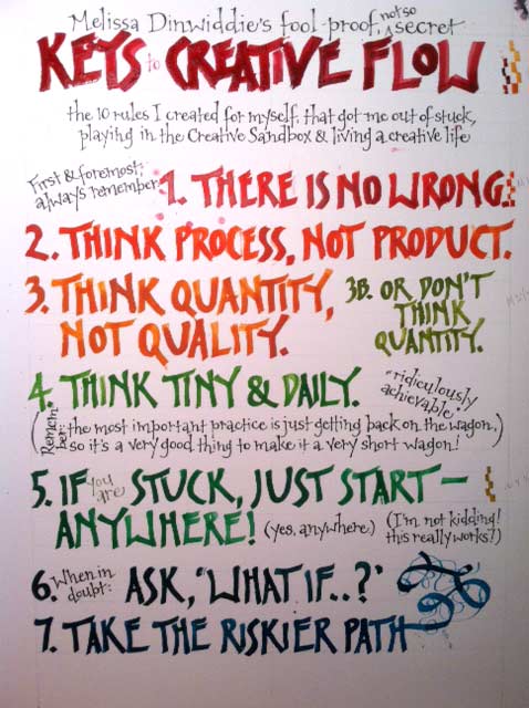
Bingo! This was it! I was ready to start work on the final art!
The problem, though, is that mixing the different shades of watercolor to the exact right consistency threatened to be much more time-consuming than I was prepared for. Plus the possibilities for time-consuming errors (blogs and splotches and such) were legion. So I opted instead to letter the entire thing out with my beloved walnut ink, and then add color later in Photoshop.
Here’s the final art, all ready for scanning:
Confession: If I were to do it over again, I’d make the walnut ink more dilute — I wish the letters appeared more transparent — but imperfectionism won out, and instead of a perfect poster that’s still in the works, I have an imperfect poster that’s DONE! 🙂
What a feeling of accomplishment!
Again, please share! I made this poster for YOU! Pin it, share it on Facebook, tweet it, post it on your website…
Then let me know how the keys make a difference in your own creative life.

PS — For a graphic the size of the one above, without having to download and upload to your own site, just copy and paste the following code:
<a href=”https://melissadinwiddie.com/keys”><img style=”border: 1px solid black;” alt=”Melissa Dinwiddie’s Keys to Creative Flow” src=”https://melissadinwiddie.com/wp-content/uploads/2014/02/KeysToCreativeFlow_795x1599.png” width=”795″ height=”1599″ /></a>
PPS — Pssst! Know someone who might benefit from seeing this today? Pass it on!
Yes, I know much of the world is wrapped up in Christmas right now (no pun intended), but I’m getting married on Saturday (!), so naturally it’s All Wedding All The Time around here.
Except when it’s not…
As I’m sure you’ve discovered, life doesn’t conveniently pause to accommodate life events. Every day for at least a week my intention has been to work for several hours on the ketubah. And every day for at least a week I’ve been re-learning the truth of my mantra:
The thing I do first is the thing that gets done.
In other words, if I don’t get to work on the ketubah (or whatever my big goal is) first thing (okay, after meditating and journaling, but..)
…before checking email
…before whatever appointment is on the calendar
…before laundry
…before baking cranberry bread for the pre- and post-wedding brunches
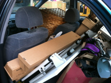
…before driving a carload of stuff to Goodwill (finally!)…
I may never get to it!
But deadlines are magical things, and with seventeen years under my belt as a professional ketubah artist, I’m used to completing artwork in time for someone’s wedding! It always takes longer than I think it will, but it always gets done.
I’ve been documenting my process (mostly using Instagram, which I’m kinda falling in love with), and thought it would be fun to share it here.
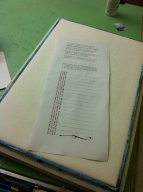
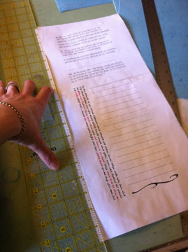
I should say that I did the heavy lifting (designing and copyfitting the layout of the text) a week or so ago. In radically reduced shorthand, the next steps are as follows:
1) Paint the canvas onto which the text will be collaged/sewn
2) Paint the paper on which the text will be calligraphed
3) Calligraph the text (which involves a lot of lettering trials, to see what looks best, what density the ink should be, etc.)
4) Collage/sew the calligraphed text paper onto the canvas
5) Add any final elements to the piece
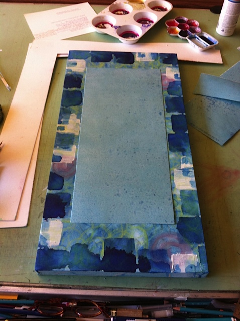
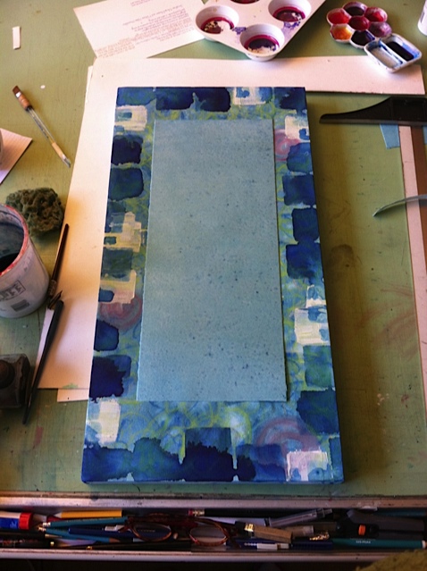
With the layout done and printed onto plain old computer paper as a spacing guide for my calligraphy, it was time to paint the canvas. And oh, boy, “white page syndrome” was hitting me hard!
But I was determined to treat this as a Creative Sandbox project, and not get all precious and perfectionisty, dammit! So after priming the canvas with Daniel Smith watercolor ground (so I could use water media like ink and watercolor paint in addition to acrylic mediums), I broke the ice by “scribbling” all over the canvas using a ruling pen:
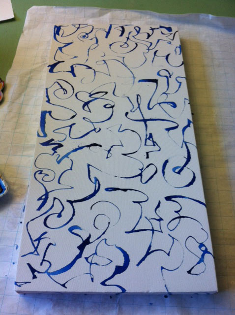
I kinda liked that, but knew I wanted a more layered, textural final effect, and that this was just the start. It served an important purpose, though: kinda like the first door ding on a brand new car, it let me relax and just start “making messes,” my preferred way to work.
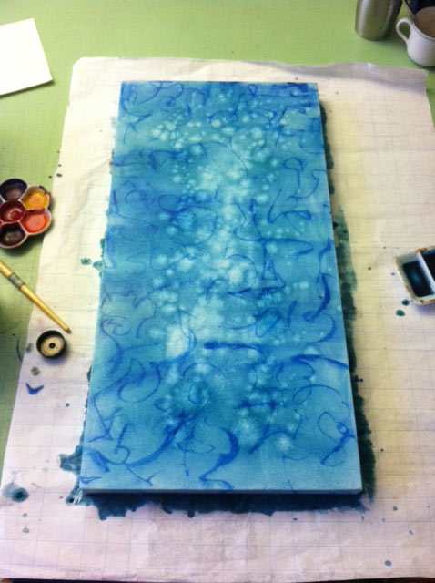
Next I added a wash of Ziller blue ink, muted with a bit of walnut ink. And when a accidentally splashed a drop of water on the wet canvas, I intentionally added a bunch more water splats for texture:
Then while the paint was still drying, I smeared some random smears of watercolor ground, using an old credit card:
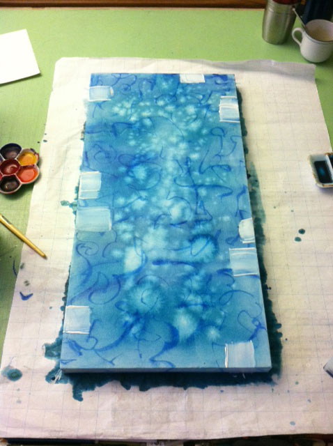
Then added some all-over pastel scribbles (very pale — hard to see here) and three pink pastel spirals (you can see evidence of my testing out different pastel colors on the paper underneath the canvas, at the bottom right):
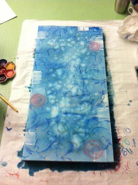
I sprayed SpectraFix over this (my favorite pastel fixative — no solvents!!!), and while that was still wet, I smeared the pink spirals with my finger:
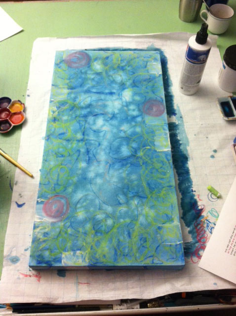
I felt the canvas was crying out for some spring green, so added some pastel scribbles around the borders:
And when the watercolor ground smears got mushy from all that media, I refreshed them, again using a credit card:
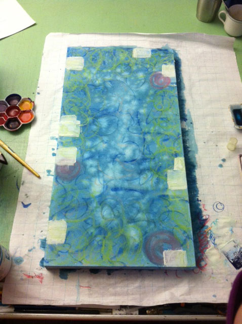
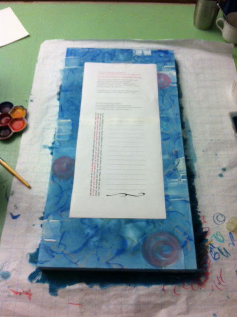
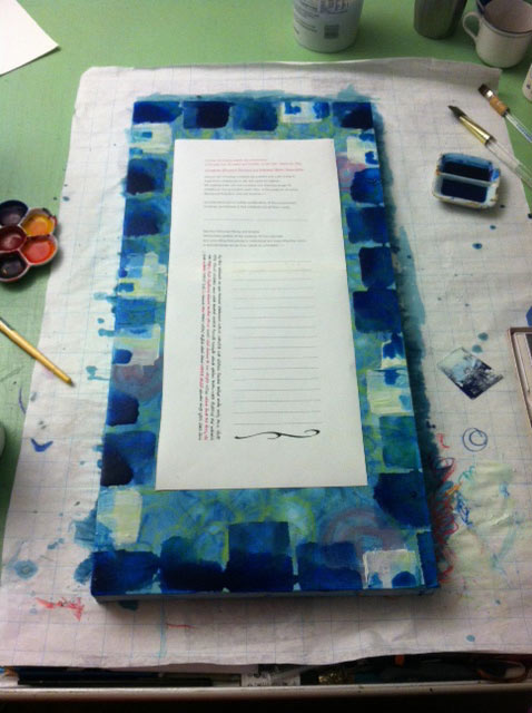
I liked what was happening here, but felt the borders needed stronger emphasis, so went around with a large flat brush and blue Ziller ink (again, somewhat “contaminated” with walnut ink, and perhaps a drop or two of green Ziller — I can’t remember now…). This pic shows the printed template for the text and signature lines on top of the canvas:
As you can see, I was getting my hands dirty for real!
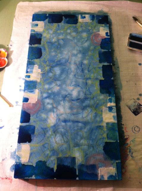
And here’s a pic of the canvas, sans text template (the moiré effect at the bottom is courtesy of my phone and the lights, and not part of the actual canvas):
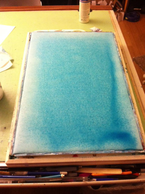
At this point, although I knew I’d probably add more layers to the canvas, I decided to turn my attention to the paper on which I’d be doing the calligraphy. I wanted it to be a blue-green that complemented the canvas. So I stretched a full sheet of Arches 140# hot press watercolor paper, and went to town (sorry, no process pics here — I forgot to shoot them! This pic shows after several layers of paint already.)
Now I ran into my first big technical glitch: this batch of Arches creates a splotchy effect when wetted. Certain spots in the paper absorb more pigment, making it appear as if the paper is mildewed or something!
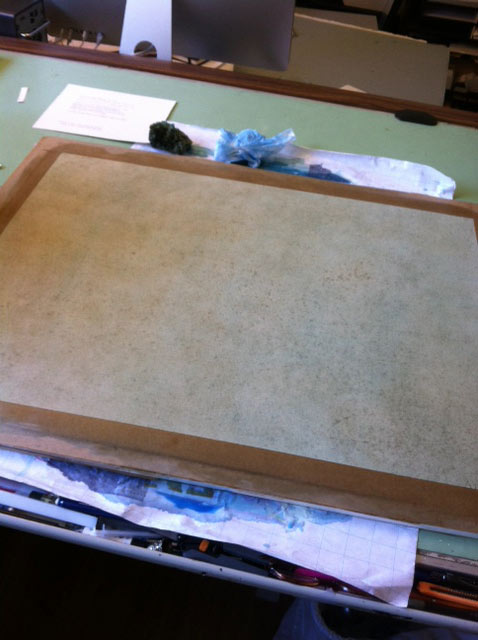
I was very unhappy about this splotchiness, plus the color was turning too green/brown for my taste, so I decided to stretch a half sheet of a new sheet of paper, this time on my Boga Board.
Here I am blowing it dry, after several light washes of Ziller + walnut ink, and liberal scraping with an aquarelle watercolor brush handle (for texture, but really because I’d inadvertently added one or two scratches, and if you haven’t figured out by now, my favorite method for dealing with “mistakes” is to feature them):
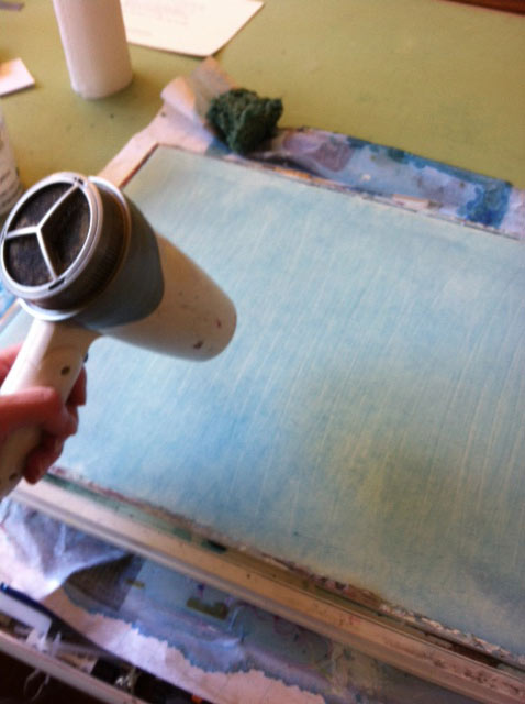
Unfortunately, I didn’t realize until I’d already wet the paper that the sheet was not Arches, as I’d asumed, but Fabriano Uno. Uh, oh…
I had a Very Bad Experience with Fabriano Uno several years ago, when I decided to try it out for a client’s ketubah.
Bad Move. Never use a paper you’re not familiar with for a client piece, especially when the deadline is fast approaching!
In that particular case, a watercolor tree design, I did the painting before the calligraphy, which is reverse of my usual method — normally I do the lettering first, and add any painting/artwork afterwards. But I was very nervous about this painting, and was afraid of sinking several hours into the calligraphy, only to ruin the piece went I went to paint, and have to start over again.
So the painting was done, and then I made an error in the calligraphy — right in the groom’s Hebrew name, in fact.
Normally this is not nearly as big a deal as it sounds — I almost always make at least one mistake in a big ketubah text. With Arches it’s a fairly simple (albeit slow and tedious) process to carefully scrape off the ink with a scalpel, then burnish the paper down and treat it with gum sandarac to prevent bleeding when you write on it again. I’d done this procedure dozens of times, and it always went off without a hitch.
Not with the Fabriano Uno, however. When I went to write on the “fixed” paper, I might as well have been writing on tissue paper, it bled so badly!
PANIC!!!!
I think I tried at least two more times, and each time it bled worse. Now I was in danger of scraping right through the paper, and I still hadn’t fixed the error!
And did I mention that the clients were picking the piece up the next day?
Um, yeah…
Ultimately, I was able to solve the problem by outlining both bride’s and groom’s names in gold ink, so they appeared to be floating on a gold field. It’s a common tradition to make the first instance of the bride’s and groom’s names extra decorative, so it wasn’t out of place for me to do this. I then added some gold dots as decoration on their English names, to balance out the piece.
Whew… Crisis averted! And the clients were happy.
But back to my own ketubah. After the washes were dry on the Fabriano, I tested some lettering, and guess what? It bled.
Argh!
So back to the drawing board. I pulled the Fabriano out of the Boga Board (there may have been some swearing involved…) and stretched a third sheet — this time my tried and true Arches again.
Here it is, stretched and ready to paint, with the text layout template on top:
Unfortunately, this sheet had the same splotchy problem as the full sheet I’d started with (you can see it looks a little mottled, even without any paint on it.)
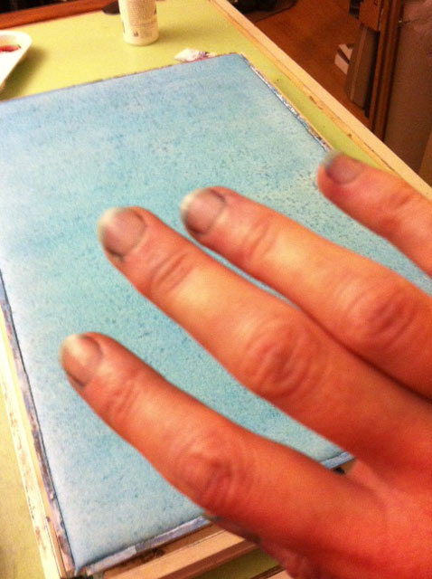
But I decided to see what would happen anyway. Here it is with a wash of the same Ziller ink + a bit of walnut ink blend, angled slightly to allow the paint to pool at the bottom (and you can see by the dark pool in the upper left of this photo that I didn’t do a fabulous job of stretching…)
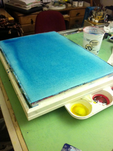
And another pic, from a different angle:
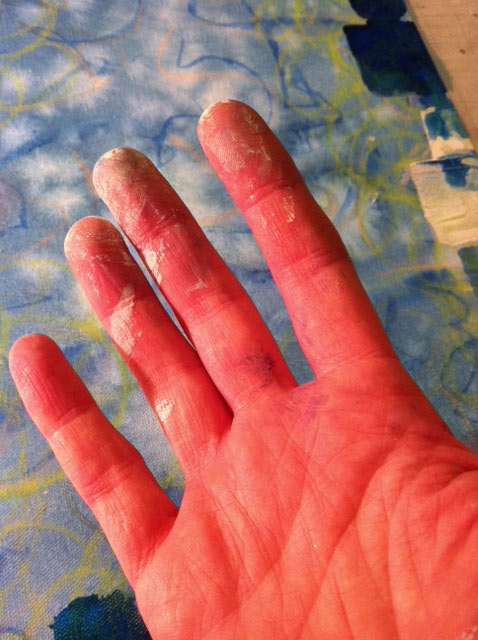
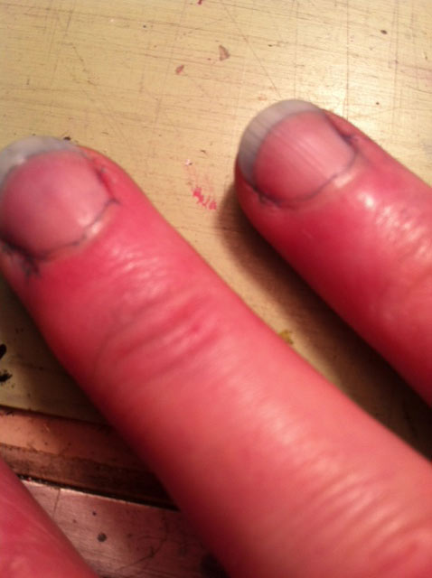
After much blotting with paper towels, and re-applying of washes using a natural sponge (see 15 second videos here and here), my fingernails and cuticles were blue! Even after using my favorite barrier cream, Gloves In A Bottle (highly recommended, both as a barrier cream, and as a kickass moisturizer)!
Thank goodness there were still a few days before the wedding, for the blue to wear off!
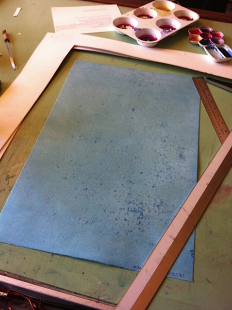
And now I had a background I was fairly happy with… even though I hadn’t planned on those %&@*# splotches!
However, given that the rest of the Arches paper was likely from the same, splotchy batch, I didn’t think it would buy me much to try yet again. So I decided to learn to love the splotches…
And when I did a quick lettering test on this third sheet, voilá, no bleeding!!!

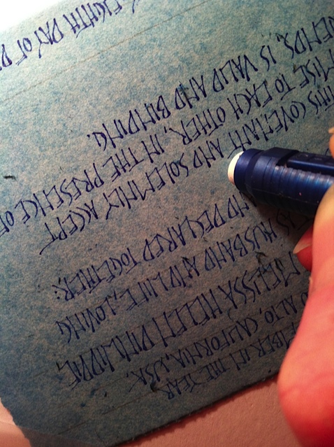
Next it was time to tear out the sheet, 7 7/16″ x 17 5/8″. Here I’m assembling my tools:
About to tear lengthwise, paper face-down on my drafting table:
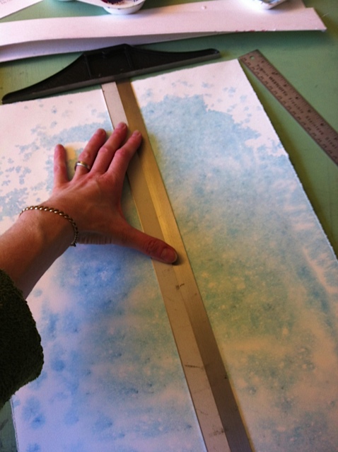
Hmph. It feels a little wide to me…
So I trimmed the printed template to give me a sense of how it would look 1/2″ narrower:
Better…

And yes, definitely better. I could have trimmed even more, but it’s virtually impossible to tear off less than 1/2″, so I’ll probably leave it be. (And I’m happy that the biggest and most annoying of the splotches was part of the torn-off area! Yes!)
More test lettering on a piece of scrap, to try out ink densities, and confirm that this is the lettering style I want to use (very different, btw, from my original plan):
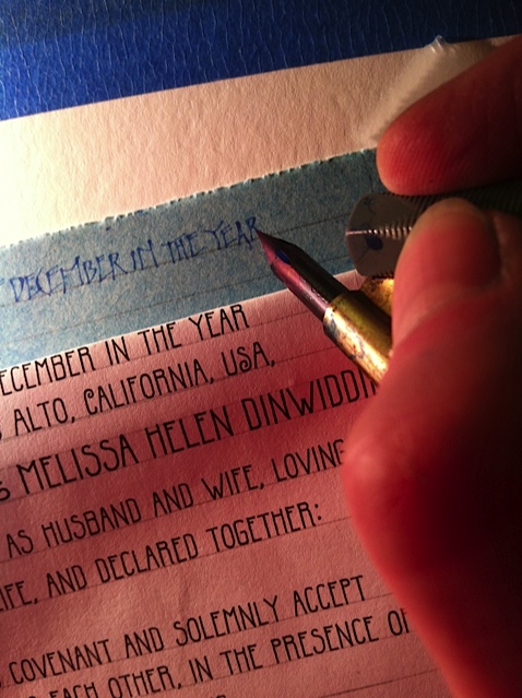
And erasing pencil lines to get a clearer sense of texture, ink density, etc:
Here’s a pic with the lettering test swatch sitting on top of the “real” paper, on top of the canvas (the key and pen nib may or may not be incorporated into the final piece. We’ll see…):
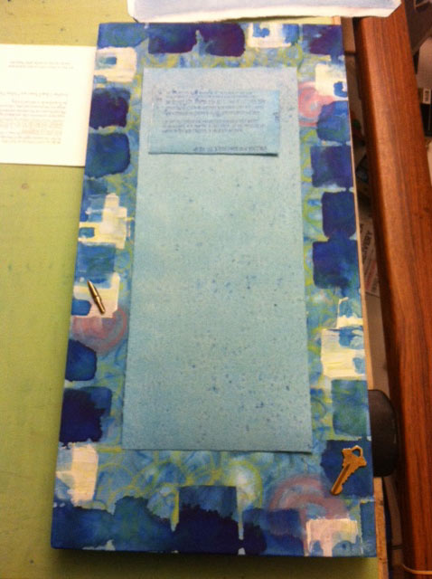
That’s where I am so far. And now back to work! Watch for more pics in another update…
Merry Merry and Happy Happy!
PS — Pssst! Know someone who might benefit from seeing this today? Pass it on!

I have a suspicion that MB is scheming to get me either a new iPad or a MacBook Air for my birthday (coming up on November 5, in case you want to send me a gift. Just sayin’.)
I’ve been lusting after both Apple devices since they were first introduced, and the prospect of owning one gives me tingles of delight.
It might seem odd, then, that the highlight of my week was taking delivery of a fully operational, vintage Royal 890 typewriter, purchased off eBay, and weighing in at over ten pounds (pictured above).
Didn’t we move on from typewriters back in the 90s? What am I doing with this obsolete item, probably built around the same time I was born? [Read more…]